
CRAIGELLACHIE
BRAND VISUAL REFRESH
The brief:
Craigellachie’s visual identity was built for packaging and print. As the brand did more online, it needed a look that could stretch across social, web and film without losing what made it recognisable.

Where the refresh started…

My role:
Art direction concept. Defined how the existing identity could expand into digital while staying recognisably Craigellachie.
Refreshing the key visuals. Kept the logo and etching-style illustrations, updated the fonts, and strengthened the colours to work on screen.
Colour by age. Gave each age statement its own colour, so every expression in the range is instantly recognisable.
Prime numbers up front. Made the age numerals a bigger feature of the design, highlighting the prime-number ages that set Craigellachie apart.


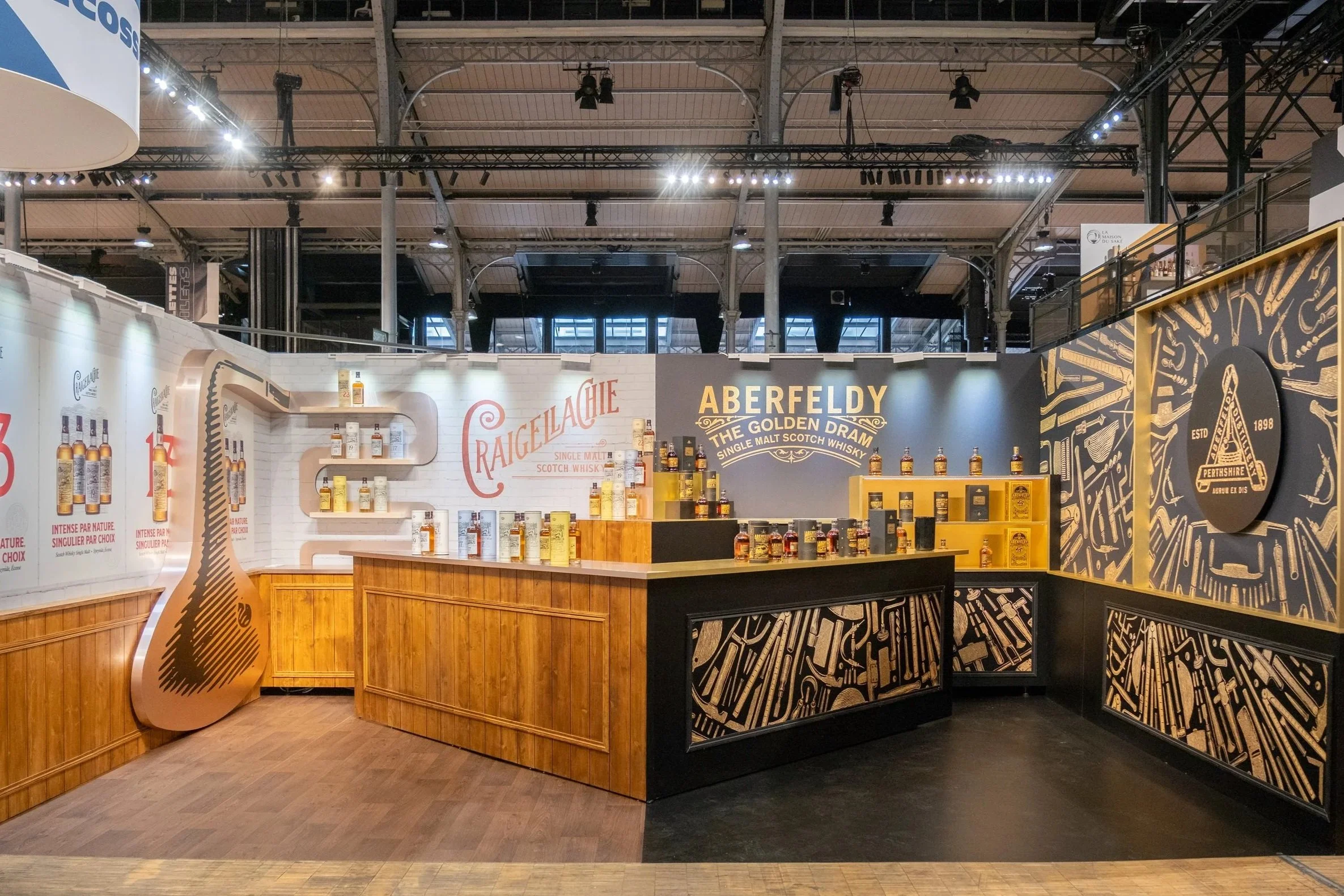
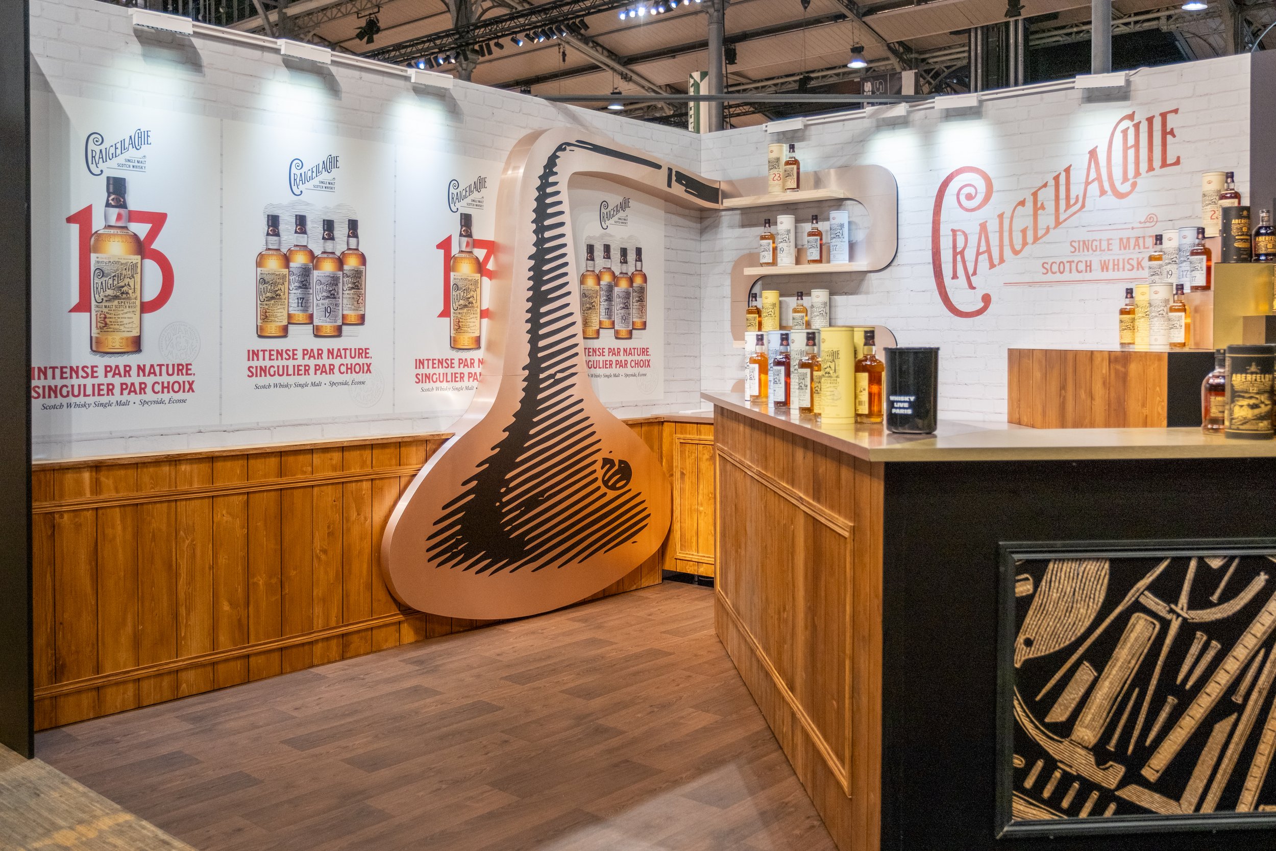

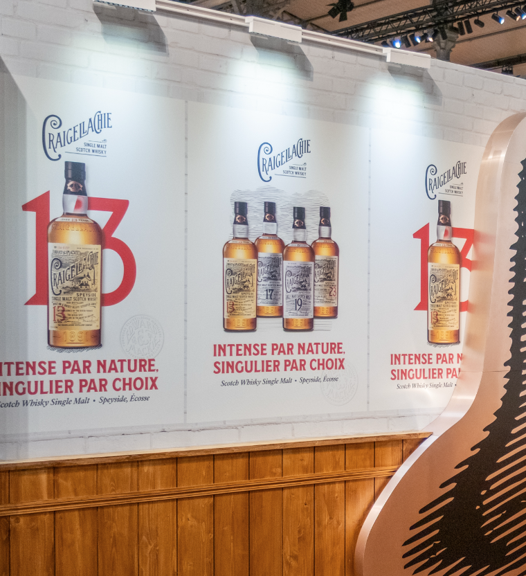
The refreshed identity has since moved off screen and onto the show floor, including at Whisky Live Paris 2026. On a stand surrounded by other Single Malts, the bold age colours and oversized prime numbers made Craigellachie easy to spot, and gave the brand known as the “Bad boy of Speyside” a look to match its reputation.
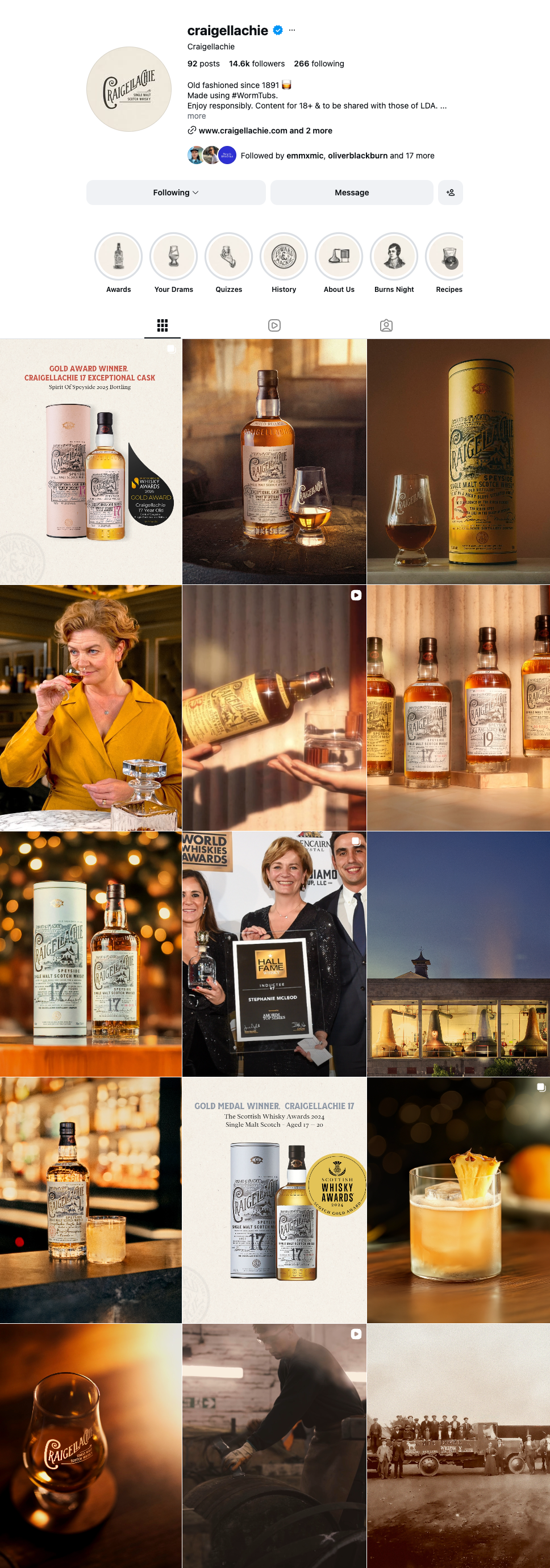
I designed Craigellachie’s Instagram posts using the refreshed identity, giving the feed a look of its own. Each age statement’s colour makes posts about specific expressions easy to recognise while scrolling, and the bold prime numbers, etching-style illustrations and new typography carry across.

