
SLAZENGER
Tennis Health Club Campaign
The brief:
Slazenger was launching its Tennis Lifestyle Collection, and the campaign needed a look that brought the brand’s sporting heritage into today’s lifestyle market. Tennis Health Club needed its own identity, carried across web, social and email.
A vintage revival
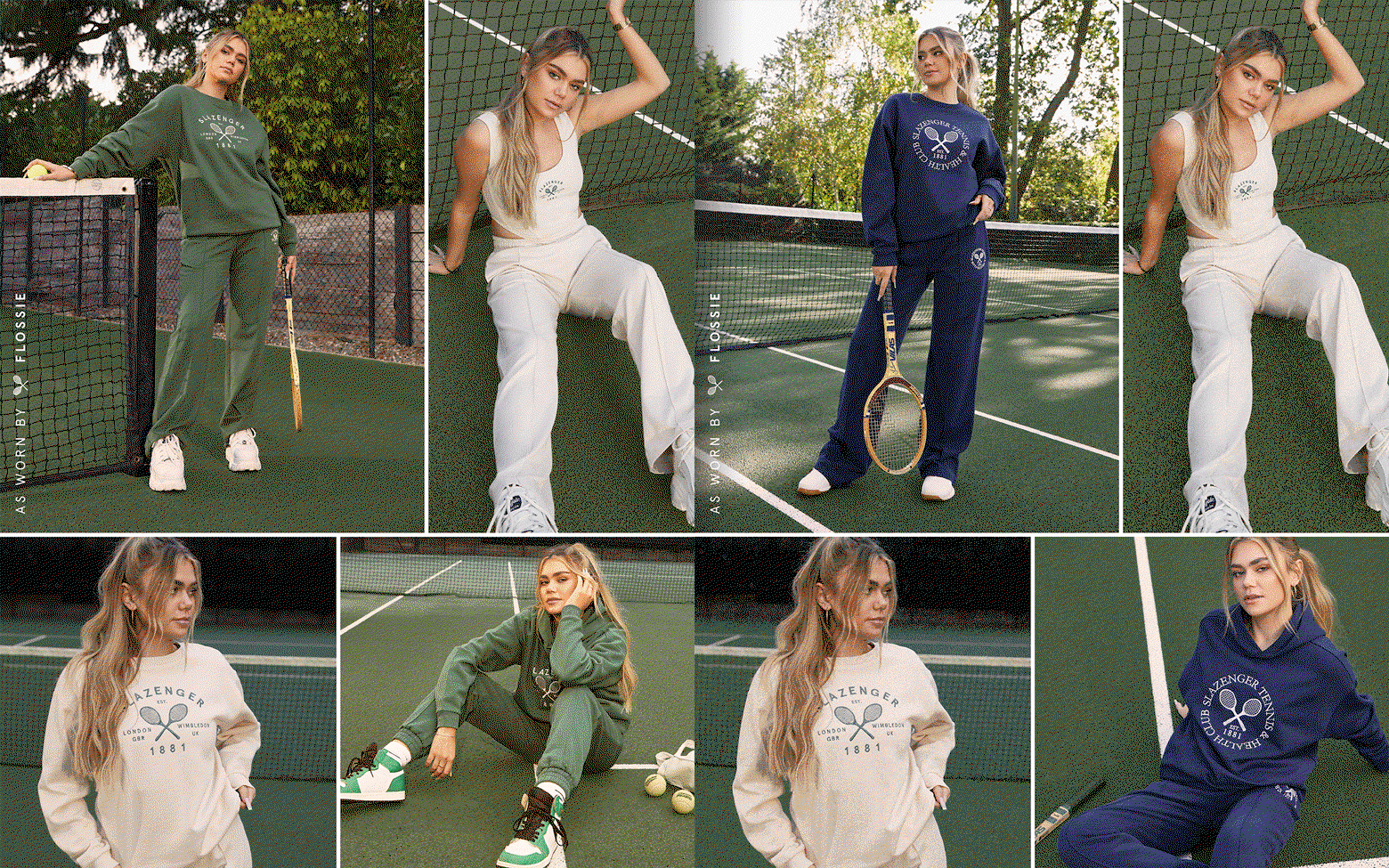
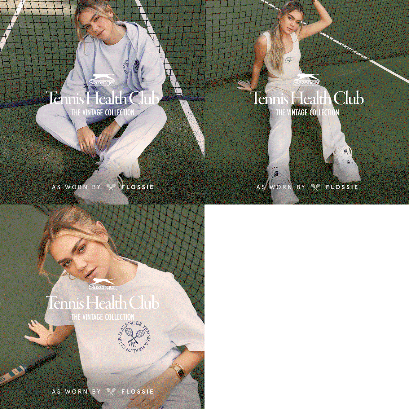
The look drew on Slazenger’s own vintage advertising and the 1980s club-sport style that brands like Sporty & Rich have brought back into fashion. A custom Tennis Health Club logo sets an elegant serif under the Slazenger panther, paired with a condensed sans-serif for the details. A palette of navy, court green and cream kept every asset looking like a members’ club, from social stories to price badges and email banners.

Social content followed two formats. “As Worn By” stories took influencers onto the tennis court, with collage layouts, vintage rackets and the club greens bringing a playful energy.
Studio stories kept things clean, setting the models against soft grey backdrops so the collection and its crest graphics stood out. Both formats used the same logo, type and shoppable price tags, so the campaign stayed consistent across every post.


My role
Art direction and social media. I created the campaign concept and the digital use only Tennis Health Club logo and visual identity, concepted and edited the social stills and videos, and rolled the campaign out across web, social and email.


